According to the Food Market Institute, the average supermarket in America stocks over 40,000 items. In this $650 billion industry, standing out from the crowd matters.
With so much choice for consumers, food and beverages are way more than just necessary nourishment. It’s an expression of our lifestyle, ethics, and personal choice.
Increased awareness of health, wellness, and environmental issues mean that your packaging has to communicate all this — and more. It’s got to be eye-catching and appealing, and should be treated with as much care as the product itself.
Great packaging is essential to consumer loyalty. It also makes the difference to whether new customers give your product a go or stroll (or scroll) past without even noticing.
With all this in mind, let’s take a look at the importance and goals of CPG packaging design, before diving into 4 branding tips that show stellar design in action.
Why is CPG packaging design important?
Great packaging design can vastly increase your sales.
This is why brands all over the world spend so much time and energy perfecting their packaging.
There are many aspects to consider. For instance, does your packaging convey your brand’s identity and ethos? Are the colors appropriate yet eye-catching? What about the typography, industry standards to adhere to, and does it actually protect the product?
Effective designs grab consumer’s attention and stay in their memory — for all the right reasons.
In research published by the Journal of Consumer Behaviour, attractive packaging triggers the areas of the brain associated with reward processing. Conversely, packaging deemed to be unattractive saw greater activity in areas that process unfair events or disgusting pictures.
CPG packaging design is vital to the success of your business. So how can you ensure your product gets off shelves and into consumer’s baskets?
Let’s take a look at the key goals of great packaging…
What are the goals of CPG packaging design?
The primary tasks of CPG packaging design are to stand out from the crowd and increase sales. With competition growing by the day, this is becoming ever more important.
The main functions of CPG packaging include:
- Protecting the product - both during transportation and on supermarket/warehouse shelves.
- Raising brand awareness - creating a positive impression in the minds of consumers.
- Increase sales - drive customer interest, recognition, and ultimately sales.
- Communicate information - ensure consumers have key facts and understand what they’re buying.
Your packaging should be treated as an extension of your marketing activities. And to achieve success, it’s crucial to employ expert help.
Some designers specialize solely in CPG packaging design. Their assistance will be invaluable. The design process not only requires technical skills and creativity but also sector-specific knowledge and an in-depth understanding of materials, form, and function.
You have to comply with strict rules and regulations if you’re selling products anywhere in the United States. The U.S. Food and Drug Administration (FDA) has guidance, but there are also state-specific rules.
So if you’re ever in doubt, just ask the experts.
4 brilliant branding tips for CPG
If you’re at the stage of briefing designers and working on packaging ideas, knowing what you want is crucial. Here are 4 key tips to bear in mind, along with case studies showing how great design increases CPG sales.
1. Know your brand identity
There’s no use creating the most beautiful, eye-catching packaging if it doesn’t reflect your brand and product! The best designs don’t follow one specific formula on color and font. Instead, they seamlessly communicate the ethos and ideas behind a company.
It’s important to make a clear statement, so start by defining your own brand identity. What do you stand for and what are the most important aspects of your product? What differentiates you from other similar products on the market?
Your colors, logo designs, and fonts will all follow from this.
For example… Minor Figures
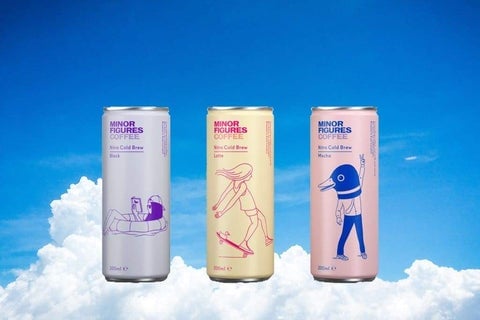
Minor Figures make and sell plant-based, 100% vegan products to “lift your coffee and your mind”. Their ethos and brand identity is front and center of the business, describing themselves as an “unlikely mob of painters, jazz musicians, basketball players, and barbers, brought together by a love of specialty coffee”.
With a clear focus on a younger audience, their instantly recognizable packaging is best in class. It’s also versatile enough to be adapted to clothing, carton drinks, and stickers.
In 2018, accompanying a brand refresh, the company launched an oat milk that flew off supermarket shelves. As well as a cool aesthetic, the new branding resulted in a growth rate of 400% over the last three years.
With a recent £7.5 billion investment to push further into the US market, Minor Figures’ rise continues at pace.
2. Keep it clear
While it’s true there isn’t a “one size fits all” approach to CPG packaging design, there are some key principles to follow. One of the most important? Clarity.
Consumers will make their shopping choices in a matter of seconds, so legible, concise lettering is essential. Don’t be tempted to go for super fancy fonts and overly complex logos. Focus instead on single-mindedness and simplicity.
Uncomplicated graphics will also add to associations with natural ingredients and processes.
For example… Justin’s Nut Butter
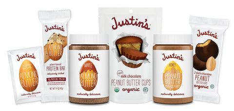
By minimizing the number of colors, designs, and text on the packaging, customers have an immediate understanding of what the product is.
With a white cover and simple imagery, Justin’s Nut Butter uses a pared-back color palette. The natural characteristics of the product are accentuated, appealing to health-conscious consumers.
Within ten years of its founding in Justin’s home kitchen, the company made it to Inc Magazine’s 5000 List of the top growing firms in America. This all led to an eventual $286 million acquisition in 2016, proving that simplicity really does pay off.
3. Balance form and function
Aesthetics are undoubtedly important, but any CPG company knows that visuals also need to balance with practicality. Depending on your product, different materials and shapes will be needed.
This is just as important during storage and transport, as it is on supermarket shelves and inside consumers’ cupboards. You’ll start losing money if retailers are frequently invoicing for damaged products.
If your company sells chips, for instance, it’s no good having beautiful packaging that reveals a heap of crushed shards when opened in customers’ hands!
Pringles are the ultimate example of form and function in this market. The innovative tube design and resealable lid were specifically developed to prolong freshness and protect their stackable chips.
But in terms of less mainstream brands, there’s...
For example... Kikkoman
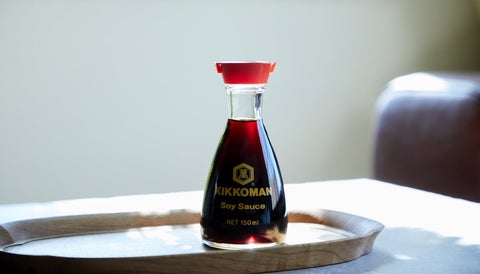
Kikkoman's soy sauce is produced using a traditional Japanese recipe with only four ingredients: water, soya beans, wheat, and salt. Their packaging is a great example of form and function working together.
In the packaging design, ancient aesthetics have been expressed through modern materials. For a table-top sauce, its wide base, virtually unbreakable glass, and innovative non-drip spout are perfectly matched to purpose. The harmonized “old and new” approach continues with the logo design and imperial red cap contrasting with the bottle’s soft curves.
Kikkoman is one of America’s fastest-growing food brands. Already claiming the largest share of the domestic soy sauce market, they jumped an impressive twelve places up the Brand Finance Food 50 2020 ranking (from 34th to 22nd).
This equates to 36% annual growth, valuing the company at over $3 billion.
4. Stand out on the shelves
Last but certainly not least is making sure that you stand out on the shelves. You’ll be surrounded by competitors and alternative products — so grab consumers’ attention!
Shelf impact should be a key consideration for any CPG packaging design. Put yourself in a shopper’s shoes and ask why you’d be drawn to your product over another. Standing out could be as simple as a splash of unexpected color, or completely break the mold in terms of presentation, shape, and materials.
Remember that products will often be merchandized shoulder-to-shoulder (that is, side-by-side), so how does your packaging look when the design is repeated?
For example… Good Hair Day Pasta
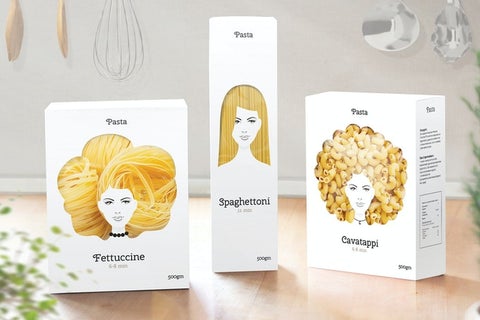
This CPG packaging design by Nikita Konkin won numerous awards — and it’s not hard to see why.
The whimsical design for this high-quality pasta brand puts simplicity, elegance, and the product itself in the spotlight. With a largely female sales demographic, the packaging instantly appeals with a humorous touch.
This innovative packaging stands out from the crowd and has developed an almost cult following for the brand. If you need any more persuasion, just take a look at the product on supermarket shelves. Wouldn’t you want to give it a try?
But packaging alone won’t get you stocked.
And in this highly competitive industry, Buffalo Market help brands stand out. As the leading distributor of purpose-driven food and beverage brands, we specialize in ethos-driven, innovative products.
Get in touch today to tell us about your brand and your needs, and find out how we can help grow your business.
